When was the last time you found yourself trying to run a proper parabola in a corn field? Or when did you last get really radical four times in a row, just to make the imaginary real?
Most of the SAT math section is about stuff you’re probably not going to use outside of a formal math environment.
For example, the Heart of Algebra section makes up 30% of the section, and it’s mostly linear algebra. It’s really important for math, but you’re probably not going to use y=mx+b to understand the world around you or make daily decisions. Passport to Advanced Math is also 30% of the section, and it mostly adds an exponent to all of that algebra, hardly changing its import to the regular world.
Kickstart Your SAT Prep with Test Geek’s Free SAT Study Guide.
But what if I told you there was a secret middle child, forgotten by its parents and ignored by its peers, only to be intuitive, surprisingly practical, worth just as many points as the other sections and possibly one of the best places to pick up points on the SAT math section?
Welcome to the dark side, people. Welcome to Problem Solving and Data Analysis.

Problem Solving and Data Analysis: What’s Included?
College Board created the Problem Solving and Data Analysis questions to test your ability to use your math understanding to solve real-world problems. Your SAT score report will list this domain as one of three scored domains (along with Heart of Algebra and Passport to Advanced Math), assigning you a score of 1-15.
Fortunately, College Board has a terrible poker face, and they’ve decided to tell you which cards they’re holding right up front. Here’s what you’ll see:
- Ratios, rates and proportions
- Percentages
- Measurement quantities and units
- Scatterplots
- The relationship between variables and graphs in a data context
- Linear vs. exponential growth
- Data tables
- Sample, population, inferences and other statistical survey topics
- Mean, median, mode and other related concepts
You will see a total of 17 questions in this section, which makes it worth about 30% of your SAT math score.
And since data and calculators go together like spam and mayo, you’ll only see these questions on section four (the calculator section). They could, however, appear in either the multiple choice or the open response portions of the section.
Think about that for a moment: 17 of the 38 questions in section 4 are Problem Solving and Data Analysis questions. That’s 45% of the section!
Data Analysis: Statistics and Data Collection
Let’s talk about politics for a second. Okay, sorry, I’m not trying to be your uncle Greg at Thanksgiving. Let me rephrase: I want to talk about political surveys for a second. We are all familiar with them, regardless of which side of the aisle you sit on, so they make a familiar example.
Presidential surveys are one of the great accomplishments in the history of statistics nerds. They can describe the views of hundreds of millions of people by asking about a thousand people.
And despite some recent bad press in the last few years, they typically do a surprisingly good job. Much like Taylor Swift on even her worst day, most of them are within a few percentage points of perfection.
How do they do this, though? A lot of people instinctively want to say that a survey must include everyone if it is going to be accurate. Fortunately, that’s not true. Instead, it just needs to follow a few basic principles.
Let’s start by defining a couple of key terms:
- Sample: The group of people being surveyed. In a presidential election survey, the sample is the survey respondents.
- Population: The group of people being described. In a United States presidential election survey, the population is all American voters.
So, we ask questions of a sample in order to learn something about the population.
What’s the key to making this all work correctly? Picking your sample well. In fact, the single most important part of survey design is selecting a sample that accurately reflects the population.
A good sample has three features:
- Randomly selected: Any population has outliers in it. There are probably a thousand people in America who particularly enjoy wearing matching outfits with their dog and only talking in bark. But those people are kind of weird, and if we only asked them who they were voting for, our sample probably wouldn’t be reflective of all of America.
- Large enough to represent the population: You don’t need to get too into the details here, but you can’t accurately describe a big group by asking six people. You can, however, describe a class of 400 students by asking 80 kids, and you can describe a country of 300 million by asking a thousand. Normally, sample size issues will be glaring (if they exist).
- Part of the population: If you want to learn something about how America is going to vote, don’t poll Canadians and definitely don’t poll the French.
Those statistics nerds mentioned earlier spend a lot of their time trying to get samples that are reflective of the population. The success of a survey depends on it. But let’s say they do everything right. Their sample size is sufficiently large, they randomly selected their people and the sample is part of the population. What can they learn from the results?
There are a few caveats that should come with any survey results:
- Samples tell us what is likely, not what is necessary. I’m not going to get too into things like confidence intervals because those concepts are beyond the scope of the SAT. But surveys are ultimately just telling us what is very likely to be true, not what is guaranteed to be true. For example, every presidential election survey comes with a “margin of error” disclaimer. That is telling that the results are not a concrete number but are instead likely to fall within a certain range.
- Different samples might yield different results, even if they are both done correctly. This follows directly from the first point. If surveys are totally precise, we shouldn’t expect them to give us exactly the same results every time.
- Correlation doesn’t equal causation. For example, a recent study showed that a rooster crows every single morning. Also, get this, the sun rises every single morning, typically right after the roosters crow. Better correlation doesn’t exist. But is all of this crowing actually causing the sun to rise? Of course not. They are perfectly correlated, but that’s not the same thing as causation.

Statistics and Data Collection Practice
Let’s take a look at a practice problem:
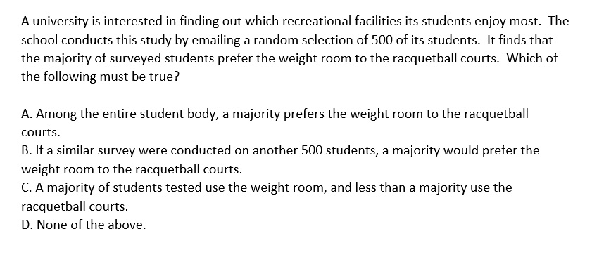
Let’s think back through our three caveats regarding samples: they tell us what is likely to be true rather than what is necessarily true, two different samples can vary and correlation doesn’t equal causation.
The last sentence in the question is asking us what must be true rather than what is likely to be true. That creates an issue right off the bat, but let’s go through our answer choices to see what we have to work with:
- A: Can we say that the entire studenty body must have the same preference as the sample? Of course not.
- B: Must a second sample yield exactly the same results as the first? Of course not.
- C: This is just an incorrect interpretation of the survey itself. The university didn’t ask students what they use, it asked what they prefer. Those are two different things, so this can’t be the right answer.
- D: This is all we have left, so that’s our answer.
Problem Solving and Data Analysis Basics: Mean, Median and Mode
Mean, median and mode on the SAT math section tends to only require two things:
- Basic concept understanding (calculate the mean or median given a data set)
- An understanding of how mean, median and mode vary when things change
Our comprehensive guide to mean, median and mode digs into these concepts more deeply, but I want to give the most important points here.
First, the definitions:
- Mean is the average of a set of numbers. Add them up to get the sum, and then divide the sum by the number of numbers you have.
- Median is the middle number when the numbers are sorted from least to greatest. In the set 1, 2, 5, the median is 2.
- Mode is the number that occurs most frequently. In the set 1, 2, 2, 5, 6, the mode is 2.
You should be able to calculate the mean, median and mode of any data set just by knowing the definitions. But you might also see questions about how they differ as the data set changes.
What would 200 EXTRA POINTS do for you? Boost Your SAT Score with Test Geek SAT prep.
Let’s take a look at that sort of question:
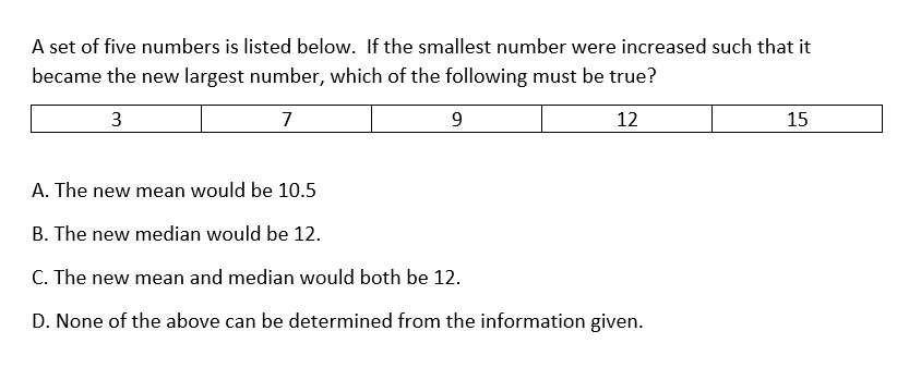
For these sorts of problems, it makes sense to actually go through the motions and create your new data set with the stated changes. Our new set would be 7, 9, 12, 15 and 16+.
Running through the answer chocies:
- A: Can we calculate the mean if we don’t know exactly what the last number is? No, so this can’t be our answer.
- B: Can we calculate the median if we don’t know exactly what the last number is? Yes, we can. The median doesn’t depend on the outside numbers. In this case, our median is 12, so this is the right answer.
- C: We can’t calculate the mean, so this can’t be right.
- D: B is correct, so this is incorrect.
Visual Representations of Data
Numbers are boring, but pictures sell. This is why I’ve included pictures of a rooster, a little girl holding corn and Derek Zoolander in this post. I know your weaknesses. We humans may have opposable thumbs for smartphone use, but we have short attention spans. Just show us the pictures! And, surprisingly, College Board is sort of in on this, too. They love to figure out ways to express numbers with pretty pictures.
Okay, they aren’t pretty pictures. They are things like scatterplots, which are to great pictures like Kevin Hart is to great big people.
These questions often present a scatterplot followed by several questions. Here’s an example:


First, let’s look at the first question. The “line of best fit” is the line in the scatterplot that is shown, and it better reflects the data points than any other possible line. You can think of it as the most accurate straight line possible.
Based on this line, a price of $8.60 should result in about 110 books being sold. A price of $9.20 would result in about 70 books being sold, so the answer is 40.
On the second question, note that the text below the scatterplot tells us that we are working with twelve weeks. Data points above the scatterplot represent weeks where more books than predicted were sold, and points below the line represent weeks where fewer books than predicted were sold.
Six points are above the line, so more books were sold than predicted in 50% of weeks (6 divided by 12).

Models: The Scary Side of Problem Solving and Data Analysis
If you want to take some information that is otherwise-intuitive and easy to understand and make it such that a PhD is required to grasp it, figure out how to put it inside of a model.
Imagine you go to the fair, which costs $10 to get into, and you ride three rides at $5 each. That’s all pretty simple, right? You will spend $25 total, and if you want to ride an additional ride, that will be an extra $5. You could have understood this in elementary school.
But watch what happens when we put it into a model:

At this point, “given user” is probably giving up and going home. Sonic has corn dogs, too, you know.
But while this sounds complicated, remember that it is really the same scenario I laid out before: It’s ten bucks to get in, and five bucks per ride. If you have $30 to spend, how many rides can you ride?
It’s an easy question in a hard package. So what are we going to do? We’re going to take it out of the package.
We can do this by plugging in for the variable c and solving just as we would with any algebra problem:

The key to most model problems is to plug in values. Models can run two ways, though. They can either ask you to find a value when a model is given, or they can ask you to pick which model best describes data. Either way, plugging is your friend.
Problem Solving & Data Analysis: Final Thoughts
Problem Solving and Data Analysis is an opportunity to pick up points for many students because, unlike all of the algebra and geometry you are going to be tested on, these questions often involve some level of unfamiliarity.
Becoming familiar with an easy concept that you simply don’t know is about as easy as points gettin’ gets. And many of these concepts don’t involve much technical math; rather, they require you to understand some fundamental idea and then execute easy math.
Putting this together, you should see that this is a category where you should spend the time needed to excel. In my opinion, Problem Solving and Data Analysis is maybe the biggest opportunity for most SAT math students.


Comments